"Give a girl the right shoes, and she can conquer the world."
-Marilyn Monroe
Showing posts with label art. Show all posts

Saturday, September 6, 2014

Fierce Sexy Claws.

This week, we'll take a break from the tedious mascara process and focus on something fun! Let's do some nail art.
 Today we're going to be learning a simple, sophisticated design perfect for any occasion!
Let's get started.

For this tutorial you will need:

At least 1 striper nail polish. They can be found at any Wal-Mart or drugstore, for this tutorial I use white and a sliver glitter polish but the accent glitter is completely optional if you don't want to get too complex. They can be distinguished from regular nail varnishes by their unusually thin packaging. These are used for precision lines, an absolute must have for this tutorial. The brush will look something like the photo given.


this photo is not mine or of my nail art, I will be later uploading
a photo of my own nails later
Full credit to whoever created this as I have no idea
who did it.


1 regular colored polish of your choice, my only piece of advice is that if you want the color of your design to be light (such as white or a pastel color), choose a dark polish to put underneath it. Reverse if you chose a dark striper color, chose a lighter base color. This will help your design to stand out as much a possible.

1 Top coat. This will add a beautiful shine to your design and help it stay in place without chipping. Base coat is optional, as it is hard to find one that will apply well without becoming so thick it just peels off of your nail the next day, it's only perpose is to protect your natural nail, but if you take breaks in between wearing varnishes, you'll be fine.

Let's begin by placing our first coat of our base color directly onto our nail. Make sure you wipe the excess lacquer off the brush and stem before applying it onto your nail. Don't worry about it not being completely opaque, another coat should be applied using the same discarding technique that we used for the first layer. This ensures that our varnish doesn't bubble, dries more quickly, and has less of a possibility to get damaged.
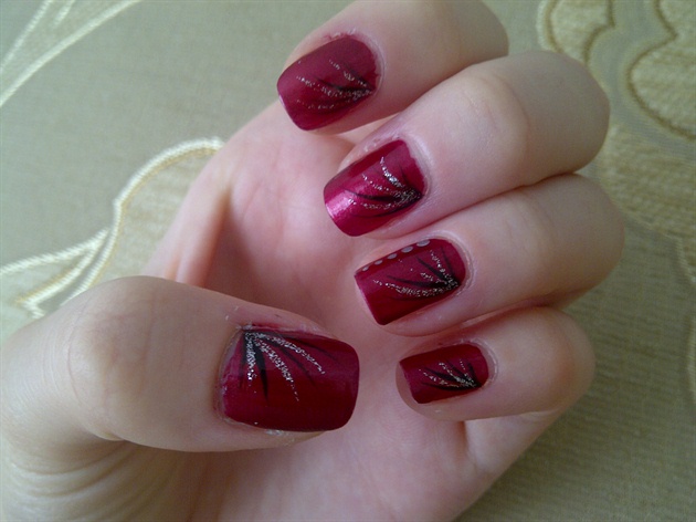
once both coats have completely  dried, take your striper, wipe the extra product off, and begin your design! Start at any corner of the nail you like and start with the bottom flair. You can create the flair by simply guiding the brush in a swooping upward motion, until the line becomes very fine, seemingly disappearing from view. Continue making the flairs until you have three, all swooping out a little above one another (make sure you have enough space between them to create another flair, this step is very important), make sure that they all connect in the corner so they appear organized.
Now you have the option to create two more flairs with your glitter striper. In between the first and second flair, place a glitter flair. Now create one in between the second and third and you're done! This simple design can be created with any colors, and suits any and every event. Have fun cuties!

Until next week,

                  God Bless.


Tuesday, August 26, 2014

Maybe She's Born With It, Maybe It's Not A Shitty Mascara.

Today I'm going to be reviewing a few of the drugstore mascaras that I've tried, giving reviews on my experience with them. Keep in mind this is my experience, and these mascaras could work differently for you depending on the type of lashes you have. You should also know my biases toward mascaras lean highly toward the quality of color and how well it separates. That's really what I look for in a mascara so naturally I'll give those products a better review.
I'll be reviewing three drugstore mascaras and one high-end mascara to show you the differences and what to look out for.
Let's go!


The first mascara I'd like to cover is Maybelline's The Rocket Volum' Express.

Pro's: Smooth application, I purchased the waterproof version of this mascara and it did resist the water very well.
Con's: Clumped badly, didn't volumize well, very flaky.

I purchased that mascara in a dark brown shade, 
just to accentuate my eyecolor. By the first application I already disliked it, It did not give my lashes any volume, instead I found it clumped no matter how hard I tried, or how little product I used. After about a month or two it had already dried out. Removing this mascara was a chore, I had to wait until I showered the next morning and use two different makeup removers to get it to come off. However this is a problem you face with almost every water-resistant mascara is that it...well... resists water.
 Overall stars out of 5:  *  


The next mascara I'd like to discuss is the Revlon Lash Potion Grow Luscious Volume and Length mascara.

Pro's: Beautiful dark brown color, applies quickly, provides fair volume.
                 Con's: Transfers onto your lid, takes a very long time to dry, clumping isn't a huge problem with this mascara however it's still an obstacle.

After purchasing the Rocket mascara I found the Revlon Lash Potion. I was quick to enjoy this mascara, it had a wonderful color, and didn't clump on the first coat. It didn't quite give me as much drama as I was hoping for, but it was still a good every-day mascara. I purchased this product in Blackened-Brown, coupled with a darker brown gel eyeliner it looked great. There isn't much more to say about this other than it's a good standby mascara when you need something quick and not-too-dramatic. Would I repurchase it? Probably not, it was just a bit run-of-the-mill for my taste.
Stars out of 5:  *  *  *


Let's talk about falsies now. We've all heard of these mascaras, some beauty gurus swear by them. I however, have had a different experience.
I've tried a lot of this brand of mascara, but I'm going to talk about The Falsies Winged mascara today.

Pro's: Rich dark black color, potion was not too thick or dry, lasted for months.
           Con's: Did not wing lashes as advertised, transfers badly, clumps, hard to apply.

This mascara was indeed high-drama, that can either be a good thing or a bad thing depending on how it was applied. It was a very picky mixture, and with the slightly confusing curved wand, it was an adventure to figure out how to use. Once you solve the puzzle however it's a fairly decent product. I was not too overly impressed as when you would apply over one coat it would become overly shiny, as if it was too oily. I don't think I'll be purchasing this again, but if you're feeling brave go ahead and try it for yourself and tell me how it worked for you!


Stars out of 5:  *  *


Now for our high-end mascara.
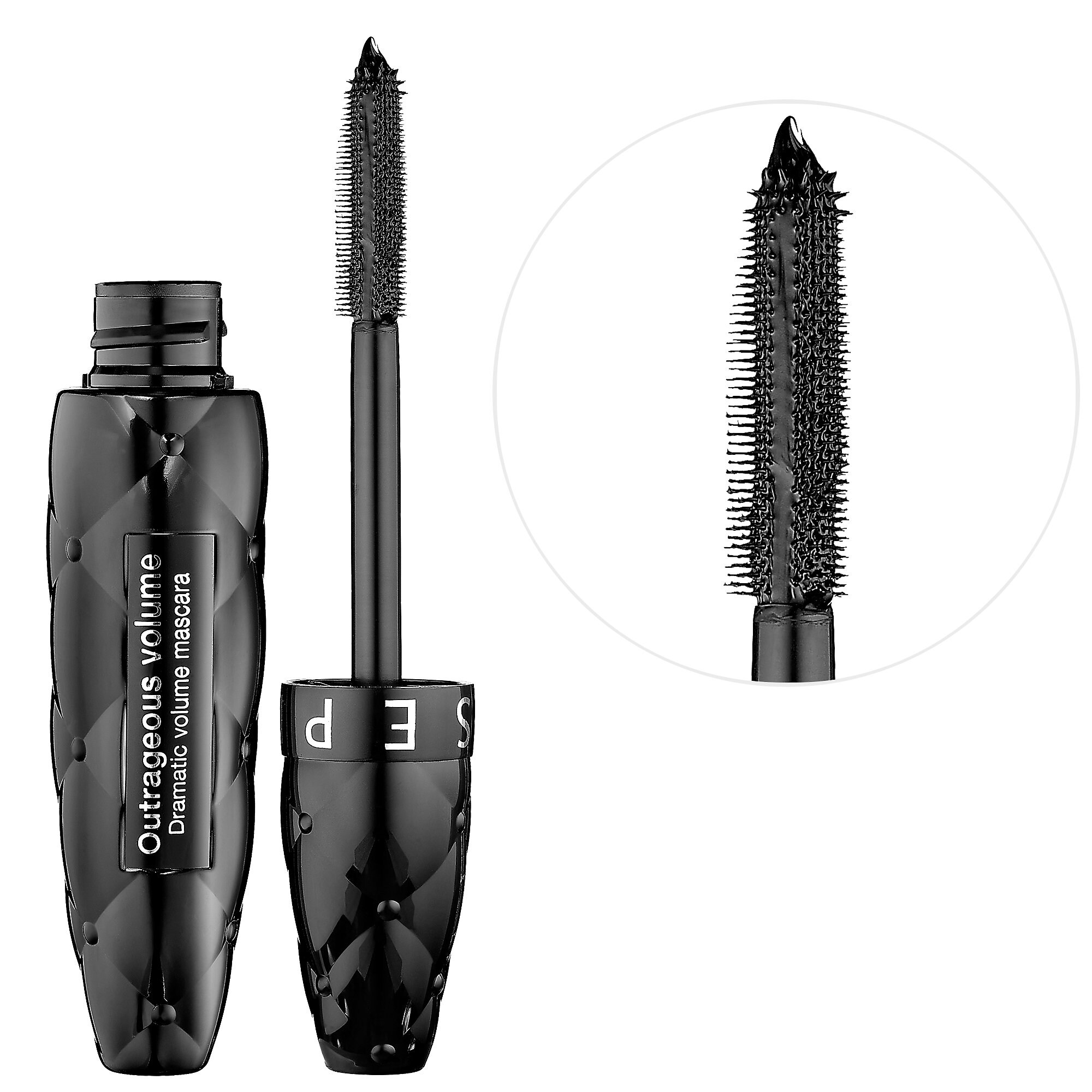
I'll be reviewing the Sephora Outrageous Volume brand product today, a reasonable beginning step into the confusing realm of the professional makeup world.

Pro's: Deepest black color I'd ever received in a mascara, high-drama, great length, a well-rounded product for the beginning makeup artist.
  Con's: Very thick potion, causes lashes to clump rather easily, becomes flaky after a few  hours of wear.

It's a bit of a trick to get this mascara not to clump, but it can be done, which is more than I could say for some of our drugstore counterparts. It just takes very little product and no more than one coat of the mascara. However, that is all you need of this product, the color is so rich and the product is so thick one layer is all you need. It's a great tool for people who are interested in starting into the
professional makeup scene. It was my first Sephora product and I'll always love it, even thought it was a little frustrating to apply. Not only was the volume spectacular, the length was wonderful as well. Always a 'love it' product, I highly recommend it, although it isn't the mascara I'm using currently (which I love even more than the mascara I'm talking about today, this mascara will have a separate review, where I'll be talking about mascara wands and the difference in lash potions separately). The product would transfer a little, but only if you pushed your lashes up into your lid, so that really wasn't an issue.
Over all I love this product and I recommend it to everyone who is willing to spend a little more time on their makeup daily, just to make sure it's applied correctly.

Total stars out of 5:  *   *   *   *


That's my product review for you this week! Next week I'll talk about tips and tricks to help your mascaras last longer, and helpful hints on how to apply it like a pro, with no clumps and perfectly lush lashes every time!
Until next week.

                   God Bless,

Saturday, June 28, 2014

Surrealism?

So today what I want to do is talk about one of my more popular art pieces, and the technique/supplies I used to create it. 
So for this what I did was draw the basic outline, I added no detail save for the basic shapes of the eye, beak and tail. The current kind of watercolors I use come in an almost acrylic like form before you add the water, so what I did was add the smallest amount of water possible, to where the texture of the paint was still pasty, took a small round brush and stippled on the first layer of light green onto the body, excluding the wings, tail, and underbelly, which I took a different brush, using the same stippling technique, and put a layer of very light pink all over the area.
For the side of the bird, I left the area nearest to the belly the light green, and layered the darker greens on top of it until it was the depth I wanted. The head I took liberty with and added a splash of blue and red, using the stipple technique, because I wanted to keep the texture consistent. Then, (again keeping the paint more 'pasty') I filled in the eye with black, adding a small dot or two of while for reflection.
As for the belly, I left the pink, took a white and began to highlight the breast area. Moving downward onto the tail I filled it in with darker pink, this time bringing the paint to a more watery consistency. Eventually we see the dark edge of the tail, to the right, where I took a purple, and just a hint of blue and blended them for shading.
And as for the wings, I added a lot of water to a cream color, and used randomized strokes downward, pulling it in many directions, and letting it drip a little. Then I took a darker, more concentrated pink and stippled it, following the directions of the cream I pulled. 

As for the flower I forget what the hell I did exactly.
For the finishing touch, I took some of my brightest colors and splattered them, adding to the surrealism aspect I really wanted for this piece.

I used mostly smaller round brushes to create the bird, as for brand and size number I don't quite remember, but my philosophy has always been that, it's not the tools you use, but the artist behind them.
One thing that I find helpful for myself however, is mood music. while creating this painting, I listened to really relaxed songs, like Brian Crain's Song For Sienna, and Cannon in D. I suggest using mood music but it may not work for everyone. It's simply my preference.
If you enjoy these more regular art related posts, let me know! I'd love to keep doing this.

Find my Instagram here http://instagram.com/color_coma where I post a lot of my other pieces, if you're interested!
         God bless.

Friday, June 20, 2014

Something New?

So here I've decided to begin giving some backstory on my art that I've uploaded to Instagram..
Particularly this drawing right here.
Originally I wanted to do some music/artist inspired art, so I chose one of my most favorites, Lorde. Namely her song "Biting Down." I usually don't draw things too macabre, but one can only paint so many butterflies. I drew this when I was feeling particularly unwell, so that's why it's kind of half-ass I guess... However one detail I would like to bring attention to is the rose petals down at the bottom of the illustration. I could've put more effort into the petals, but I was sick, and in a very fuck-it mood. It was more of a personal detail anyway... The fallen petals represent the eventual fade of beauty, the simplicity of realizing that under our skin, we're all just skeletons. Also, to bring to mind the bouquets we lie on the caskets of our dead; perhaps more for the loved ones than the deceased. How we, like petals, eventually fall from our home upon our blooming flower of a world, one by one, eventually to rest, forever still, below our blossom.

Not much was to challenging about this piece, just the alignment of the facial features, as per usual, getting all of the creases of where the bone slopes and curves. Skulls are unusually sculpted, rather strange, almost alien-looking. All in all I had a lot of fun with this drawing.

If you'd like to know what tools I used, feel free to ask, as well as any other questions you may have. I'd also love to know if you like hearing more back story on my art, leave your thoughts below!
On my Instagram I take requests and host art contests, as well as post my original work, if you'd like to see more, follow me at http://instagram.com/color_coma
I'm also thinking about doing how-to-draw tutorials on YouTube, would you enjoy that? Leave your feedback in the comments and I'll try my best!

God Bless.